- 所在位置:
- 首页 >
- 编程技术 >
- CSS/HTML >
- css三列自适应布局怎么写?教你三种方法
css三列自适应布局怎么写?教你三种方法
Admin 2021-04-26 群英技术资讯 1561 次浏览

css怎么写三列自适应布局?在做前端开发的时候我们经常会使用三列布局,那么两边固定,中间自适应的三列布局要怎么写呢?下面是小编整理的多种实现方法,有需要的朋友可以看一下。
前言
为了按照常规WEB布局,这里全部采用拥有header和footer模式进行左中右布局编写。
第一种:基于float实现
实现思路
常规思路,使左右两个Aside分别浮动至左右两侧即可
代码实现
<!-- HTML部分 -->
<div class="container">
  <!-- 顶部Header -->
  <header>这里是头部</header>
  <!-- 中间aside及content -->
  <div class="middle clearfix">
    <aside class="left"></aside>
    <aside class="right"></aside>
    <!-- 中间content显示内容 为了防止将右侧挤下去故放置在右侧栏下方 -->
    <div class="content">这里是内容</div>
  </div>
  <!-- 底部Footer -->
  <footer></footer>
</div>
<!-- CSS部分 -->
<style lang="scss">
  * {
    margin: 0;
    padding: 0;
  }

  .clearfix {
    zoom: 1;
    &::after {
      display: block;
      content: ' ';
      clear:both
    }
  }

  html, body {
    width: 100%;
    height: 100%
    }
    .container {
      width: 100%
      height: 100%
      header {
        height: 80px;
        background: rgba(0, 0, 0, 0.5)
      }
      footer {
        height: 80px;
        background: rgba(0, 0, 0, 0.5)
      }
      .middle {
        height: calc(100% - 80px - 80px)
        aside {
          height: 100%;
          width: 300px;
          background: rgba(156, 154, 249, 1)
        }
        .left {
          float: left
        }
        .right: {
          float: right
        }
      }
    }
  }
</style>
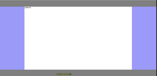
实现效果
第二种:基于position:absolute实现
实现思路
为中间三栏父级赋予position: relative,赋予左右Aside position: absolute,并且分别赋予left: 0 right: 0 width:自定义值,赋予中间content left,right 分别等于左右width即可
代码实现
<!-- HTML相关代码 -->
<div class="container">
  <!-- 顶部Header -->
  <header></header>
  <div class="middle">
    <!-- 左侧Aside -->
    <aside class="left"></aside>
    <!-- 中间content内容 -->
    <div class="content">这里是内容</div>
    <!-- 右侧Aside -->
    <aside class="right"></aside>
  </div>
  <!-- 底部Footer -->
  <footer></footer>
</div>
<!-- CSS相关代码 -->
<style lang="scss">
  * {
    margin: 0;
    padding: 0
  }

  html, body {
    width: 100%;
    height: 100%
  }

  .container {
    width: 100%;
    height: 100%;
    header {
      height: 80px;
      background: rgba(0, 0, 0, 0.5);
    }
    footer {
      height: 80px;
      background: rgba(0, 0, 0, 0.5);
    }
    .middle {
      height: calc(100% - 80px - 80px);
      position: relative;
      aside,
      .content {
        position: absolute;
      }
      .left {
        width: 300px;
        background: rgba(156, 154, 249, 1);
        left: 0;
        height: 100%;
      }
      .right {
        width: 300px;
        background: rgba(156, 154, 249, 1);
        right: 0;
        height: 100%;
      }
      .content {
        left: 300px;
        right: 300px;
      }
    }
  }
</style>
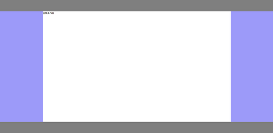
实现效果

第三种:基于display:flex实现
实现思路
赋予左中右三列父级display: flex,赋予左右Aside width自定义,赋予中间content flex:1即可
代码实现
<!-- HTML相关代码 -->
<div class="container">
  <!-- 顶部Header -->
  <header></header>
  <div class="middle">
    <!-- 左侧Aside -->
    <aside class="left"></aside>
    <!-- 中间content内容 -->
    <div class="content">这里是内容</div>
    <!-- 右侧Aside -->
    <aside class="right"></aside>
  </div>
  <!-- 底部Footer -->
  <footer></footer>
</div>
<!-- CSS部分 -->
<style lang="scss">
  * {
    margin: 0;
    padding: 0;
  }

  html, body {
    width: 100%;
    height: 100%;
  }

  .container {
    header {
      height: 80px;
      background: rgba(0, 0, 0, 0.5);
    }
    footer {
      height: 80px;
      background: rgba(0, 0, 0, 0.5);
    }
    .middle {
      display: flex;
      height: calc(100% - 80px - 80px);
      aside {
        width: 300px;
        background: rgba(156, 154, 249, 1);
      }
      .content: {
        flex: 1;
      }
    }
  }
</style>
实现效果

第四种:基于display: table实现
实现思路
赋予左中右三列父级display: table, width: 100%,分别赋予左中右三列display: table-cell,分别赋予左右Aside width即可。
代码实现
<!-- HTML相关代码 -->
<div class="container">
  <!-- 顶部Header -->
  <header></header>
  <div class="middle">
    <!-- 左侧Aside -->
    <aside class="left"></aside>
    <!-- 中间content内容 -->
    <div class="content">这里是内容</div>
    <!-- 右侧Aside -->
    <aside class="right"></aside>
  </div>
  <!-- 底部Footer -->
  <footer></footer>
</div>
<!-- CSS部分 -->
<style lang="scss">
  * {
    margin: 0;
    padding: 0;
  }

  html, body {
    width: 100%;
    height: 100%;
  }

  .container {
    header {
      height: 80px;
      background: rgba(0, 0, 0, 0.5);
    }
    footer {
      height: 80px;
      background: rgba(0, 0, 0, 0.5);
    }
    .middle {
      display: table;
      width: 100%
      height: calc(100% - 80px - 80px);
      aside {
        width: 300px;
        display: table-cell;
        background: rgba(156, 154, 249, 1);
      }
      .content: {
        display: table-cell;
      }
    }
  }
</style>
实现效果

第五种:基于display: grid实现
实现思路
赋予左中右三列父级display: grid,并且使用grid-template-columns: 300px auto 300px,将其分为宽为300px、auto、300px三列布局即可。
代码实现
<!-- HTML相关代码 -->
<div class="container">
  <!-- 顶部Header -->
  <header></header>
  <div class="middle">
    <!-- 左侧Aside -->
    <aside class="left"></aside>
    <!-- 中间content内容 -->
    <div class="content">这里是内容</div>
    <!-- 右侧Aside -->
    <aside class="right"></aside>
  </div>
  <!-- 底部Footer -->
  <footer></footer>
</div>
<!-- CSS部分 -->
<style lang="scss">
  * {
    margin: 0;
    padding: 0;
  }

  html, body {
    width: 100%;
    height: 100%;
  }

  .container {
    header {
      height: 80px;
      background: rgba(0, 0, 0, 0.5);
    }
    footer {
      height: 80px;
      background: rgba(0, 0, 0, 0.5);
    }
    .middle {
      display: grid;
      grid-template-columns: 300px auto 300px;
      height: calc(100% - 80px - 80px);
      aside {
        background: rgba(156, 154, 249, 1);
      }
    }
  }
</style>
实现效果
文本介绍了五种css实现三列自适应布局的方法,有具体的代码示例,希望对大家学习CSS布局有帮助。更多CSS布局内容大家可以关注其他文章。

免责声明:本站发布的内容(图片、视频和文字)以原创、转载和分享为主,文章观点不代表本网站立场,如果涉及侵权请联系站长邮箱:mmqy2019@163.com进行举报,并提供相关证据,查实之后,将立刻删除涉嫌侵权内容。
猜你喜欢
-
HTML5中body全屏背景图片怎么实现,哪些事项要注意
这篇文章主要介绍了HTML5 body设置全屏背景图片的示例代码,本文通过实例代码给大家介绍的非常详细,对大家的学习或工作具有一定的参考借鉴价值,需要的朋友可以参考下
-
HTML中table表格边框实现思路和代码是什么
本文通过实例代码给大家介绍了HTML table表格边框的实现思路,非常不错,具有一定的参考借鉴价值,需要的朋友参考下吧
-
CSS3中如何让字体有渐变色的效果,方法是什么
方法:用background-clip让渐变背景色在文本区域显示,语法“文字元素{background-image:linear-gradient(..);background-clip:text;color:transparent;}”。
-
HTML中要如何合并表格边框?方法是什么?
这篇文章给大家分享的是HTML实现合并表格边框的内容,因为给table和td标签加边框时,默认使用双边框,那么怎样次啊能实现合并表格边框呢?文中会使用HTML+CSS来实现这个效果,感兴趣的朋友接下来一起跟随小编看看吧。
-
用纯CSS怎么制作加减按钮,思路和方法是什么
这篇文章主要介绍了纯CSS实现数字加减按钮的最佳方案,本文给大家介绍的非常详细,具有一定的参考借鉴价值,需要的朋友可以参考下


推荐内容
成为群英会员,开启智能安全云计算之旅
立即注册关注或联系群英网络
7x24小时售前:400-678-4567
7x24小时售后:0668-2555666

24小时QQ客服

群英微信公众号
CNNIC域名投诉举报处理平台
服务电话:010-58813000
服务邮箱:service@cnnic.cn
投诉与建议:0668-2555555
Copyright © QY Network Company Ltd. All Rights Reserved. 2003-2020 群英 版权所有
增值电信经营许可证 : B1.B2-20140078 ICP核准(ICP备案)粤ICP备09006778号 域名注册商资质 粤 D3.1-20240008


